|
|
 Hagrid Hagrid |
|
|
Posts: 12,005
Posts Per Day: 2.80
Reputation: 71.14%
Rep Score: +49 / -21
Approval: +20,405
Gold Stars: 534
|
Tweet 1695028265054785690 will appear here... Personally think its awful, but taken into account its been designed by a young lad so its unfair of me to critique that when he's done his best. Just hope we dont have to wear it too often! |
|
 Logged Logged |
Online |
|
|
|
|
| 140381 |
|
Guest User |
|
| Logged |
|
|
|
|
| 123614 |
|
Guest User |
Love it, think it's great.
|
|
| Logged |
|
|
|
|
 bigbadmarinerbob bigbadmarinerbob |
|
Lager Top Drinker  Posts: 289
Posts Per Day: 0.12
Reputation: 81.78%
Rep Score: +1 / 0
Approval: +126
Gold Stars: 2
|
|
|
|
|
|
|
| Mandy Dunnit vs Hettie |
|
 Table Wine Drinker  Posts: 542
Posts Per Day: 0.10
Reputation: 89.2%
Rep Score: +8 / 0
Approval: +1,468
Gold Stars: 15
|
There’s some miserable gits on Twitter really having a go about this shirt. I think it looks good, especially as it was designed by a young fan who surely we should encourage and support?
|
|
|
|
|
|
| Southwark Mariner |
|
Whiskey Drinker  Posts: 3,162
Posts Per Day: 0.69
Reputation: 78.29%
Rep Score: +21 / -6
Location: London
Approval: +3,550
Gold Stars: 83
|
If I was 11, I'd design one with a wind turbine and a trawler sailing away, taking inspiration from Turner's Fighting Temeraire!
Still, this one is probably more in line with the competition brief!
|
|
|
|
|
|
| aldi_01 |
|
|
Posts: 12,008
Posts Per Day: 2.03
Reputation: 73.73%
Rep Score: +54 / -20
Approval: +5,679
Gold Stars: 473
|
Compared to how good last years was, it’s awful but credit to the lad that’s put the effort in and designed it.
Curious as to what the others looked like…
|
| 'the poor and the needy are selfish and greedy'...well done Mozza |
|
|
|
|
|
|
| pizzzza |
|
 Pontoonite Posts: 5,663
Posts Per Day: 1.06
Reputation: 69.75%
Rep Score: +20 / -10
Location: Grimsby
Approval: +6,701
Gold Stars: 137
|
Looks ok to me. It's a third kit so has the licence to be experimental and different to what has come before. The inclusion of the Dock Tower is a nice touch.
|
|
| Logged |
|
|
|
|
| pizzzza |
|
Pontoonite Posts: 5,663
Posts Per Day: 1.06
Reputation: 69.75%
Rep Score: +20 / -10
Location: Grimsby
Approval: +6,701
Gold Stars: 137
|
There’s some miserable gits on Twitter really having a go about this shirt.
That's Twitter for you... |
|
| Logged |
|
|
|
|
| diehardmariner |
|
Vodka Drinker  Posts: 5,951
Posts Per Day: 0.99
Reputation: 84.65%
Rep Score: +36 / -6
Approval: +17,614
Gold Stars: 538
|
|
| Logged |
|
|
|
|
|
| Mandy Dunnit vs Hettie |
|
Table Wine Drinker Posts: 542
Posts Per Day: 0.10
Reputation: 89.2%
Rep Score: +8 / 0
Approval: +1,468
Gold Stars: 15
|
That's Twitter for you...
Fair point! Don’t know why I was surprised |
|
|
|
|
|
| aldi_01 |
|
|
Posts: 12,008
Posts Per Day: 2.03
Reputation: 73.73%
Rep Score: +54 / -20
Approval: +5,679
Gold Stars: 473
|
|
|
| 'the poor and the needy are selfish and greedy'...well done Mozza |
|
|
|
|
|
| MuddyWaters |
|
Barley Wine Drinker  Posts: 14,110
Posts Per Day: 2.60
Reputation: 68.15%
Rep Score: +48 / -24
Approval: +32,247
Gold Stars: 235
|
I think it’s great. Well done Archie.
|
|
| Logged |
|
|
|
|
|
| LH |
|
 Moderator ModeratorPosts: 11,477
Posts Per Day: 1.92
Reputation: 71.54%
Rep Score: +30 / -13
Approval: +18,519
Gold Stars: 173
|
Can the adults have a go next year? Not a slight against the kit I just want to get my crayons out.
|
|
| Logged |
|
|
|
|
| immariner |
|
Whiskey Drinker Posts: 4,027
Posts Per Day: 0.67
Reputation: 82.35%
Rep Score: +20 / -4
Location: Lincoln
Approval: +3,413
Gold Stars: 61
|
Our original kit was white with blue bands wasn't it? Probably be a bit more aesthetically pleasing if there were a few more bands/hoops but I like it. When you compare it to Lincoln's third kit monstrosity it's pretty smart and could've been much worse
|
|
|
|
|
|
| Kris2 |
|
Whiskey Drinker Posts: 3,626
Posts Per Day: 0.65
Reputation: 54.03%
Rep Score: +16 / -18
Approval: +2,634
Gold Stars: 136
|
It looks fine, nobody is forcing you to buy one if you don't like it. Perhaps keeping it simple and including the dock tower on the shirt was the best option, if you go too out there to get the football hipsters on board who wear some obscure Eastern European shirt because it's wacky looking you risk alienating the core fanbase who might think it looks dumb.
At least it doesn't have rainbows on it or look like a salmon fillet.
|
|
| Logged |
|
|
|
|
|
| GollyGTFC |
|
 Whiskey Drinker Posts: 3,920
Posts Per Day: 0.68
Reputation: 67.2%
Rep Score: +19 / -11
Approval: +5,962
Gold Stars: 356
|
Tweet 1695028265054785690 will appear here... Personally think its awful, but taken into account its been designed by a young lad so its unfair of me to critique that when he's done his best. Just hope we dont have to wear it too often!
I’ll pass on the feedback when I get home from work tonight  |
|
| Logged |
Online |
|
|
|
| 140381 |
|
Guest User |
|
| Logged |
|
|
|
|
| Hagrid |
|
|
Posts: 12,005
Posts Per Day: 2.80
Reputation: 71.14%
Rep Score: +49 / -21
Approval: +20,405
Gold Stars: 534
|
I’ll pass on the feedback when I get home from work tonight
You can do that alongside the 20 quid you still havent donated for Argentina winning the World Cup  |
|
| Logged |
Online |
|
|
|
|
| GollyGTFC |
|
Whiskey Drinker Posts: 3,920
Posts Per Day: 0.68
Reputation: 67.2%
Rep Score: +19 / -11
Approval: +5,962
Gold Stars: 356
|
You can do that alongside the 20 quid you still havent donated for Argentina winning the World Cup
I did. And I went above and beyond actual because I also covered the processing fee of 50p-ish which wasn’t part of the bet. And I ticked the gift aid option so they got another £5. Not all heroes wear capes my friend. |
|
| Logged |
Online |
|
|
|
| diehardmariner |
|
Vodka Drinker Posts: 5,951
Posts Per Day: 0.99
Reputation: 84.65%
Rep Score: +36 / -6
Approval: +17,614
Gold Stars: 538
|
Now I know it's designed by Golly Jnr, I'm genuinely disappointed it's the Dock Tower and not an Excel spreadsheet incorporated into the design.
|
|
| Logged |
|
|
|
|
| chaos33 |
|
Barley Wine Drinker Posts: 11,599
Posts Per Day: 2.58
Reputation: 67.78%
Rep Score: +66 / -33
Location: The mountains
Approval: +17,934
Gold Stars: 360
|
Love it. It’s great.
|
| "You should do what you love while you can" |
|
| Logged |
Online |
|
|
|
|
| arryarryarry |
|
Barley Wine Drinker Posts: 10,256
Posts Per Day: 1.71
Reputation: 52.76%
Rep Score: +26 / -28
Approval: +10,043
Gold Stars: 116
|
Have to say I'm a fan of it and one of the best we have had for a while and far better than that horrible pink shirt.
|
|
| Logged |
|
|
|
|
| somersetmariner |
|
 Table Wine Drinker Posts: 885
Posts Per Day: 0.17
Reputation: 61.82%
Rep Score: +7 / -7
Approval: +253
Gold Stars: 4
|
A touch disappointed this year with all the kits.
but hey ho, none of them are terrible.
I just hope we get stuck in whichever colours we’re wearing.
I’m only posting because i’ve nothing else to do this evening.
|
| you can take the boy out of grimsby......but you can't take grimsby out of his soul, his blood, his semen!  |
|
|
|
|
|
| chaos33 |
|
Barley Wine Drinker Posts: 11,599
Posts Per Day: 2.58
Reputation: 67.78%
Rep Score: +66 / -33
Location: The mountains
Approval: +17,934
Gold Stars: 360
|
I think all 3 kits are cracking. Only slight criticism is how difficult to read the names are on the home shirt.
|
| "You should do what you love while you can" |
|
| Logged |
Online |
|
|
|
|
| Hagrid |
|
|
Posts: 12,005
Posts Per Day: 2.80
Reputation: 71.14%
Rep Score: +49 / -21
Approval: +20,405
Gold Stars: 534
|
I think all 3 kits are cracking. Only slight criticism is how difficult to read the names are on the home shirt.
we've only got our selves to blame for that, folk wanting stripes and red letters/numbers on the back, i sit round a few old'uns at the game and they cant tell whos who at all |
|
| Logged |
Online |
|
|
|
| benny_the_docker |
|
Shandy Drinker  Posts: 53
Posts Per Day: 0.01
Reputation: 81.78%
Rep Score: +1 / 0
Approval: -7
|
Brilliant effort! Well done to all involved! Take my money! Utm
|
|
|
|
|
|
| jamesgtfc |
|
Vodka Drinker Posts: 6,040
Posts Per Day: 1.16
Reputation: 79.95%
Rep Score: +20 / -5
Approval: +12,959
Gold Stars: 190
|
we've only got our selves to blame for that, folk wanting stripes and red letters/numbers on the back, i sit round a few old'uns at the game and they cant tell whos who at all
Some clubs are starting to sell a striped back version and a solid back version for those that want numbers. At least we haven't gone for black numbers like Darlington! Tweet 1694983684489716024 will appear here... |
|
|
|
|
|
|
| buckstown |
|
Champagne Drinker  Posts: 2,456
Posts Per Day: 0.41
Reputation: 74.81%
Rep Score: +16 / -6
Approval: +5,179
Gold Stars: 79
|
Really like it, especially the idea of incorporating the dock tower. It looks bright and fresh as well
|
|
|
|
|
|
| Mappers |
|
Champagne Drinker Posts: 2,339
Posts Per Day: 5.43
Reputation: 75.95%
Rep Score: +8 / -3
Approval: +4,318
Gold Stars: 117
|
I’ll pass on the feedback when I get home from work tonight
It's great that the club are letting youngsters design the kit , I think it's great tbf - but whatever your view on the actual kit, surely everyone must agree that fan engagement and youngster involvement is far improved and that has to be good for both now and the future . |
|
|
|
|
|
| buckstown |
|
Champagne Drinker Posts: 2,456
Posts Per Day: 0.41
Reputation: 74.81%
Rep Score: +16 / -6
Approval: +5,179
Gold Stars: 79
|
Forgot to mention, the fact that proceeds are going to a local charity is fantastic
|
|
|
|
|
|
|
| lukeo |
|
Season Ticket Holder
Posts: 12,092
Posts Per Day: 2.07
Reputation: 64.59%
Rep Score: +38 / -23
Approval: +2,372
Gold Stars: 148
|
It may take a while to warm to as it is very different. I loved last year's and bought it. This one I'm unsure if I will buy it... But I probably  Well done alfie on winning. |
|
|
|
|
|
| moosey_club |
|
Barley Wine Drinker Posts: 16,186
Posts Per Day: 2.70
Reputation: 76.19%
Rep Score: +69 / -22
Approval: +20,252
Gold Stars: 226
|
Is it my failing eyesight or .....is there no Dock Tower in sight??
|
| 2023/24 DLWDDWDLLLWDLLLLWDDDWDLLWLDLLDWDDWLLDWLWLW 2022/23LDWDWWDWLLDWWDLLLDLWLLWLWLLWDDLDWWDDDLLWDWLWLW 2021/22 WDWWWWDLWWWWLLLWLLDLWLLWWDWWWLWDLWWDWWWDLWD play offs WWW Promoted 🥳 2020/21 LLDWWLDLDWLWLLLDLWLLDLLDLLLWLLLDDDDWDDDLWLWLWL .. hello darkness my old friend 2019/20 WDLDWWLDLWWLLLDLDLDLDDWWDLLWDDWWL  WLLW - ended 2018/19 LWDDLLLLLLWWDWLLLWDWLWWWWLLLLWWWWDLLLDDLLDLWLW Hello Scunny |
|
|
|
|
|
| Azimuth |
|
Snakebite drinker  Posts: 411
Posts Per Day: 0.18
Reputation: 63.84%
Rep Score: +3 / -4
Approval: +694
Gold Stars: 60
|
It is a very very nice smart kit, a big well done to the young designer who deserves a lot of credit for his achievment and should ignor the critics who I suspect can only dream they had his talents!
|
|
|
|
|
|
|
| It Bites |
|
Champagne Drinker Posts: 2,288
Posts Per Day: 1.45
Reputation: 48.89%
Rep Score: +4 / -10
Approval: +2,166
Gold Stars: 264
|
Absolutely pathetic that a grown adult would take to social media to slag off a kit designed by a child . This world never ceases to amaze me but this is low , very low !!!
|
|
| Logged |
|
|
|
|
| ginnywings |
|
 Recovering Alcoholic  Posts: 28,145
Posts Per Day: 5.03
Reputation: 73.79%
Rep Score: +88 / -32
Approval: +56,132
Gold Stars: 548
|
I'm not fussed about footy shirts and never wear them, but I'd make an exception for that one, especially given that it's for charity.
I think it's very smart.
|
|
|
|
|
|
| WayneBurnettsJockstrap |
|
|
Posts: 2,780
Posts Per Day: 1.78
Reputation: 81.8%
Rep Score: +10 / -2
Location: Grimsby
Approval: +844
Gold Stars: 117
|
Is it my failing eyesight or .....is there no Dock Tower in sight??
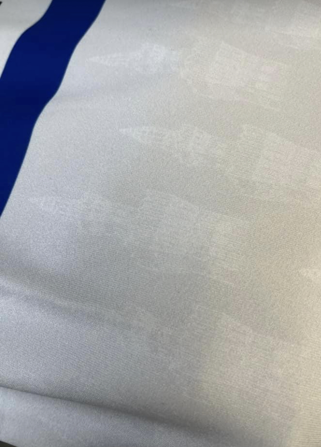
From the GTFC website “I think the colour is very nice and I don’t think we’ve ever had the Dock Tower on a shirt before. We had planned to make the Dock Tower pattern more predominant, but we had to follow the guidelines stipulated by the EFL.” Please note that the sublimated Dock Tower pattern is very faint and that’s why it isn’t visible on the promotional photographs. |
|
| Logged |
Online |
|
|
|
|
| GollyGTFC |
|
Whiskey Drinker Posts: 3,920
Posts Per Day: 0.68
Reputation: 67.2%
Rep Score: +19 / -11
Approval: +5,962
Gold Stars: 356
|
I would post the original final design he did on GranthamMariner’s PC, but as the shorts and socks colour hasn’t been disclosed by the club yet I might be breaking an unofficial NDA.
I’ll give you a clue. They’re either both blue, both grey or one of each colour.
On Archie’s design the dock tower pattern was much more prominent like the netting pattern on the red away shirt, but it had to be toned down to pass FA regulations.
Close up the shirt is more or less the same tone of grey as the Jarvis away shirt from the disastrous 2003/04 season which always looked more off white in photos and on tv than it really was.
Archie read through some of the social media relies to the launch and was happy with the many positive replies and didn’t take it personal from the grown men who don’t like it and voiced that opinion. He’s old enough to know some people (always men) take pleasure in being unkind.
In fact he pointed out to me that the competition brief was that the kit couldn’t include any black, white or red so the comments saying it’s not Town colours are ridiculous.
|
|
| Logged |
Online |
|
|
|
| easypeersy |
|
Table Wine Drinker Posts: 533
Posts Per Day: 0.13
Reputation: 67.65%
Rep Score: +7 / -5
Approval: +301
Gold Stars: 11
|
Absolutely LOVE this shirt!
So much better than the pink one from last season.
|
|
|
|
|
|
| jamesgtfc |
|
Vodka Drinker Posts: 6,040
Posts Per Day: 1.16
Reputation: 79.95%
Rep Score: +20 / -5
Approval: +12,959
Gold Stars: 190
|
I would post the original final design he did on GranthamMariner’s PC, but as the shorts and socks colour hasn’t been disclosed by the club yet I might be breaking an unofficial NDA.
I’ll give you a clue. They’re either both blue, both grey or one of each colour.
On Archie’s design the dock tower pattern was much more prominent like the netting pattern on the red away shirt, but it had to be toned down to pass FA regulations.
Close up the shirt is more or less the same tone of grey as the Jarvis away shirt from the disastrous 2003/04 season which always looked more off white in photos and on tv than it really was.
Archie read through some of the social media relies to the launch and was happy with the many positive replies and didn’t take it personal from the grown men who don’t like it and voiced that opinion. He’s old enough to know some people (always men) take pleasure in being unkind.
In fact he pointed out to me that the competition brief was that the kit couldn’t include any black, white or red so the comments saying it’s not Town colours are ridiculous.
I wonder if our red away kit was already decided last summer then. I wondered if we chose the third kit before the away kit otherwise kids designing red kits would have been instantly disqualified. It's a shame Dock Tower can't be prominently displayed, the Dortmund home kit was designed by a fan and features their stadium which I think looks really smart. I would be interested to see how the design differs from end product after all of the bureaucratic hoops have been jumped through. |
|
|
|
|
|
|
| lee65 |
|
Champagne Drinker Posts: 2,067
Posts Per Day: 0.36
Reputation: 91.63%
Rep Score: +13 / 0
Approval: +2,483
Gold Stars: 10
|
I think this shirt has a fresh, modern look, well done Archie |
|
|
|
|
|
| GollyGTFC |
|
Whiskey Drinker Posts: 3,920
Posts Per Day: 0.68
Reputation: 67.2%
Rep Score: +19 / -11
Approval: +5,962
Gold Stars: 356
|
I wonder if our red away kit was already decided last summer then. I wondered if we chose the third kit before the away kit otherwise kids designing red kits would have been instantly disqualified.
It's a shame Dock Tower can't be prominently displayed, the Dortmund home kit was designed by a fan and features their stadium which I think looks really smart.
I would be interested to see how the design differs from end product after all of the bureaucratic hoops have been jumped through.
The competition instructions pretty much gave it away that this season’s away kit was going to be red. I will post the final design Archie entered once the club have launched the shorts and socks. Other than toning down the dock tower pattern it’s pretty much identical to Archie’s design. |
|
| Logged |
Online |
|
|
|
| Captaincod |
|
Shandy Drinker Posts: 60
Posts Per Day: 0.03
Approval: +247
Gold Stars: 15
|
I really like it. A fairly simple design but quite striking, original and modern looking. For me it’s better than last years pink strip and this years red strip. Well done Archie.
|
|
|
|
|
|
|
| denni266 |
|
 Whiskey Drinker Posts: 4,294
Posts Per Day: 0.83
Reputation: 46.02%
Rep Score: +13 / -22
Approval: +700
Gold Stars: 132
|
|
| Logged |
Online |
|
|
|
| Croxton |
|
Cocktail Drinker  Posts: 1,778
Posts Per Day: 0.75
Reputation: 78.46%
Rep Score: +14 / -4
Approval: +3,014
Gold Stars: 33
|
Well done Archie and a good interview debut. Also a clever nod to our cousins at Grimsby Harriers! Tweet 1041334583642533888 will appear here... |
|
| Logged |
Online |
|
|
|
| Swansea_Mariner |
|
Whiskey Drinker Posts: 3,528
Posts Per Day: 0.61
Reputation: 85.79%
Rep Score: +22 / -3
Approval: +6,443
Gold Stars: 63
|
I really like it. Well done to the designer.
|
|
|
|
|
|
|
| Knut Anders Fosters Voles |
|
Brandy Drinker  Posts: 2,886
Posts Per Day: 1.86
Reputation: 91.64%
Rep Score: +24 / -1
Location: League 2
Approval: +8,828
Gold Stars: 554
|
I owned a Henry Lloyd jumper that looked similar to that in the late 90s.
For that reason alone, I’m all in.
Henri Beene. The smell of Rockport leather. Scrunched up Burberry jumpers for goalposts. Aaahh…ostalgie.
|
|
| Logged |
Online |
|
|
|
| Knut Anders Fosters Voles |
|
Brandy Drinker Posts: 2,886
Posts Per Day: 1.86
Reputation: 91.64%
Rep Score: +24 / -1
Location: League 2
Approval: +8,828
Gold Stars: 554
|
I owned a Henry Lloyd jumper that looked similar to that in the late 90s.
For that reason alone, I’m all in.
Henri Beene. The smell of Rockport leather. Scrunched up Burberry jumpers for goalposts. Aaahh…ostalgie.
I commented before I’d realised Golly Jnr had designed it. I’m even more in now. One of our own. An Excel bod. SUM(B4:OFFSET(B4,0,E2-1)) |
|
| Logged |
Online |
|
|
|
| moosey_club |
|
Barley Wine Drinker Posts: 16,186
Posts Per Day: 2.70
Reputation: 76.19%
Rep Score: +69 / -22
Approval: +20,252
Gold Stars: 226
|
From the GTFC website
“I think the colour is very nice and I don’t think we’ve ever had the Dock Tower on a shirt before. We had planned to make the Dock Tower pattern more predominant, but we had to follow the guidelines stipulated by the EFL.”
Please note that the sublimated Dock Tower pattern is very faint and that’s why it isn’t visible on the promotional photographs.
Oh thank fck for that.....I only saw pics of it not any wording.....I have been tilting it, squinting, polarised glasses on.....thought it was like an old magic eye picture cos at one point I am sure I saw a dolphin or a t rex .... |
| 2023/24 DLWDDWDLLLWDLLLLWDDDWDLLWLDLLDWDDWLLDWLWLW 2022/23LDWDWWDWLLDWWDLLLDLWLLWLWLLWDDLDWWDDDLLWDWLWLW 2021/22 WDWWWWDLWWWWLLLWLLDLWLLWWDWWWLWDLWWDWWWDLWD play offs WWW Promoted 🥳 2020/21 LLDWWLDLDWLWLLLDLWLLDLLDLLLWLLLDDDDWDDDLWLWLWL .. hello darkness my old friend 2019/20 WDLDWWLDLWWLLLDLDLDLDDWWDLLWDDWWL WLLW - ended 2018/19 LWDDLLLLLLWWDWLLLWDWLWWWWLLLLWWWWDLLLDDLLDLWLW Hello Scunny |
|
|
|
|
|
|
| heppy88 |
|
Table Wine Drinker Posts: 867
Posts Per Day: 0.26
Reputation: 90.8%
Rep Score: +11 / 0
Approval: +3,079
Gold Stars: 40
|
Love the shirt and have pre ordered it. This will be my first third strip. Love the fact it was designed by a junior mariner and that all proceeds go to a great local charity. So, thanks to The Trust, Archie and the club!
|
|
|
|
|
|
| Captaincod |
|
Shandy Drinker Posts: 60
Posts Per Day: 0.03
Approval: +247
Gold Stars: 15
|
The competition instructions pretty much gave it away that this season’s away kit was going to be red.
I will post the final design Archie entered once the club have launched the shorts and socks.
Other than toning down the dock tower pattern it’s pretty much identical to Archie’s design.
Looking forward to seeing the rest of the strip Golly. Personally I’d like the shorts to be blue and the socks grey/blue hoops. I think it’s a great idea for the club to let the 3rd strip be designed by junior fans. Why not go the whole hog and let all of the strips be designed by the fans ? Poojah came up with a good design for the home kit in a previous thread . Why not invite all the fans to submit entries for the first 2 strips and have a vote on the final few chosen by the club , maybe offering a season ticket to the winner. I’m sure our more creative fans could produce better designs than some of the professionals and it would stop some of the moaning old gits on here complaining if it was designed and chosen by our own fans! |
|
|
|
|
|
| Spidey |
|
Snakebite drinker Posts: 439
Posts Per Day: 0.09
Reputation: 85.92%
Rep Score: +4 / 0
Approval: +378
Gold Stars: 4
|
Really like it, well done Archie!
|
|
| Logged |
Online |
|
|
|
|
| nickmariners |
|
Table Wine Drinker Posts: 587
Posts Per Day: 0.10
Reputation: 78.29%
Rep Score: +21 / -6
Approval: +520
Gold Stars: 4
|
Tweet 1695028265054785690 will appear here... Personally think its awful, but taken into account its been designed by a young lad so its unfair of me to critique that when he's done his best!
Absolutely brilliant: "it's unfair of me to critique..." -- then he goes ahead and does >>precisely<< that anyway. |
|
|
|
|
|
| mimma |
|
Brandy Drinker Posts: 2,650
Posts Per Day: 0.44
Reputation: 85.27%
Rep Score: +15 / -2
Approval: +5,573
Gold Stars: 78
|
Could I just ask, is the third kit for when we play away, and the home team play in red, we then have to play in our 3rd strip to avoid a colour clash with our away kit?
if this is the case, then why can't we play in our "normal" kit?
Call me old fashioned, but to me we should always play in black and white stripes and only change when there is a colour clash with it.
I'm a traditionist, always black and white stripes!
|
|
|
|
|
|
| Heisenberg |
|
Brandy Drinker Posts: 2,592
Posts Per Day: 0.80
Reputation: 85.11%
Rep Score: +9 / -1
Approval: +5,047
Gold Stars: 93
|
For what it’s worth, I like the design, so well done to the young fan. I think it’s really smart.
My one gripe would be the general understanding of what a 3rd kit is for. I think black and white should be the default kit away from home unless the home team a) wears stripes, b) has a predominantly black shirt, or c) has a predominantly white shirt. So basically the only time a 3rd kit is necessary is when the home team has any of those features and one of the colours is red, ruling out the 2nd kit. But hear lies the problem - the 3rd kit is nearly all white (as in ‘c’ above), so how does that work?!
I think what I’m saying is, because we play in stripes, our away kits should really be a single solid colour. If an away team came to BP wearing a shirt similar to our new 3rd kit, wouldn’t they have to change it because it’s white?
It’s a minefield! And clearly the decision isn’t always about colour - why on earth did england’s women’s team have to wear blue against Spain recently? That was totally unnecessary.
|
|
| Logged |
Online |
|
|
|
|
| Hagrid |
|
|
Posts: 12,005
Posts Per Day: 2.80
Reputation: 71.14%
Rep Score: +49 / -21
Approval: +20,405
Gold Stars: 534
|
Absolutely brilliant: "it's unfair of me to critique..." -- then he goes ahead and does >>precisely<< that anyway.
Its an opinion. |
|
| Logged |
Online |
|
|
|
| GollyGTFC |
|
Whiskey Drinker Posts: 3,920
Posts Per Day: 0.68
Reputation: 67.2%
Rep Score: +19 / -11
Approval: +5,962
Gold Stars: 356
|
Pinched this off Facebook. Somebody managed to take a photo that shows off the Dock Tower pattern.
|
|
| Logged |
Online |
|
|
|
| nickmariners |
|
Table Wine Drinker Posts: 587
Posts Per Day: 0.10
Reputation: 78.29%
Rep Score: +21 / -6
Approval: +520
Gold Stars: 4
|
Its an opinion.
Whoooossshhhh! |
|
|
|
|
|
|
| Yarborough Vaults |
|
Beer Drinker  Posts: 121
Posts Per Day: 0.28
Reputation: 81.78%
Rep Score: +1 / 0
Approval: +214
Gold Stars: 32
|
I'd be interested to see what the kid's original design looked like. Getting the dock tower in there is a really good idea but sounds like it was watered down by the efl to the point of being meaningless.
|
|
|
|
|
|
| toontown |
|
Whiskey Drinker Posts: 3,420
Posts Per Day: 0.57
Reputation: 91.63%
Rep Score: +13 / 0
Approval: +6,279
Gold Stars: 70
|
I like it, impressed with it considering its been designed by a youngster
|
|
| Logged |
Online |
|
|
|
| gytone |
|
Table Wine Drinker Posts: 852
Posts Per Day: 0.14
Reputation: 77.57%
Rep Score: +6 / -2
Approval: +1,028
Gold Stars: 8
|
It's brilliant, loads better than the pink one, IMHO.
|
|
| Logged |
Online |
|
|
|
|
| Azimuth |
|
Snakebite drinker Posts: 411
Posts Per Day: 0.18
Reputation: 63.84%
Rep Score: +3 / -4
Approval: +694
Gold Stars: 60
|
Its an opinion.
Of Course you are entitled to your opinion and fair play for expressing it which you are perfectly entitled to do while we still have some freedom of speech left in this country. Sometimes, just sometimes, it is nice to keep certain opinions to ourselves, or chose our words more carefully. |
|
|
|
|
|
| White_shorts |
|
Lager Top Drinker Posts: 291
Posts Per Day: 0.17
Reputation: 58.74%
Rep Score: +1 / -4
Approval: -647
Gold Stars: 12
|
My one gripe would be the general understanding of what a 3rd kit is for. I think black and white should be the default kit away from home unless the home team a) wears stripes, b) has a predominantly black shirt, or c) has a predominantly white shirt. So basically the only time a 3rd kit is necessary is when the home team has any of those features and one of the colours is red, ruling out the 2nd kit. But hear lies the problem - the 3rd kit is nearly all white (as in ‘c’ above), so how does that work?!
We wouldn't need a third strip if the second strip was a standard all-yellow. It seems to be the norm now that teams wear second strips away from home. You could argue that is to put players in a different frame of mind in the changing room before kick-off, to prepare for a mostly hostile crowd. Let's be honest, though: it's for money-making marketing purposes. It can't be environmentally-friendly to produce three new kits each season. |
|
|
|
|
|
| The Caterham Mariner |
| September 3, 2023, 1:33pm |
|
Exile and Proud.. Snakebite drinker Posts: 460
Posts Per Day: 0.48
Reputation: 81.78%
Rep Score: +1 / 0
Location: Caterham Surrey
Approval: +80
Gold Stars: 8
|
Absolutely pathetic that a grown adult would take to social media to slag off a kit designed by a child . This world never ceases to amaze me but this is low , very low !!!
Indeed |
| An Exile and Proud !! UTM
Mariners Trust Life Member.
In the words of my Uncle Fred "You can take the man outta of Grimsby BUT you can't take the Grimsby! Out the man!" |
|
|
|
|
|
|
| The Caterham Mariner |
| September 3, 2023, 1:42pm |
|
Exile and Proud.. Snakebite drinker Posts: 460
Posts Per Day: 0.48
Reputation: 81.78%
Rep Score: +1 / 0
Location: Caterham Surrey
Approval: +80
Gold Stars: 8
|
Love the shirt and have pre ordered it. This will be my first third strip. Love the fact it was designed by a junior mariner and that all proceeds go to a great local charity. So, thanks to The Trust, Archie and the club!
Exactly well said like you have ordered too. UTM 2023--24 |
| An Exile and Proud !! UTM
Mariners Trust Life Member.
In the words of my Uncle Fred "You can take the man outta of Grimsby BUT you can't take the Grimsby! Out the man!" |
|
|
|
|
|
| Theimperialcoroner |
| September 3, 2023, 3:47pm |
|
 Moderator ModeratorPosts: 6,305
Posts Per Day: 1.05
Reputation: 90.27%
Rep Score: +47 / -4
Location: Little hale
Approval: +5,211
Gold Stars: 102
|
It’s very Tranmere
|
| Batch, Crombie, Moore K, Wiggington, Cumming, Waters, Bonnyman, Ford, Emson, Drinkell, Whymark. Love you all, You are the reason I'm on here. You've had help from Todd, Handyside, Futcher P, Groves, Mendonca, Macca etc etc etc. Up The Mariners!!!!!!!!! |
|
|
|
|
|
|
 Site Home
 News
News
 Football
 Season
 Database
 Club
Club
 POM
POM
 Contact

 Hagrid

 bigbadmarinerbob


 Logged


 WLLW - ended